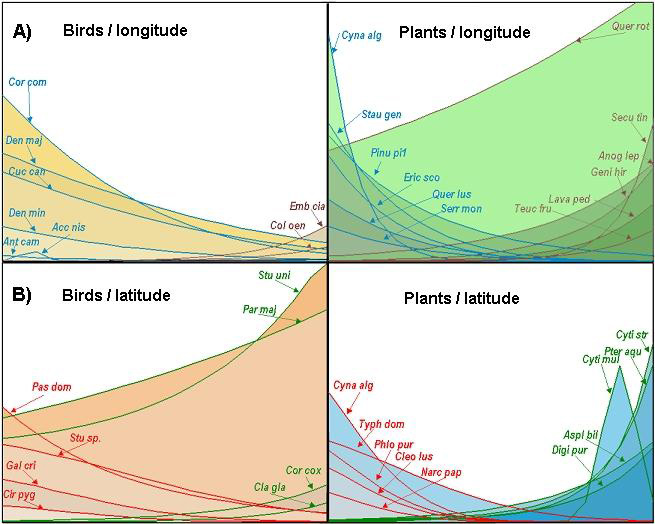
Fig. 6. A) GLM using longitude as the explanatory variable (represented in km on the X axis); the Y axis represents plant cover (1–6) and bird frequency (1–18). The blue lines represent species that were more abundant in the west; brown lines represent species that showed a preference for the interior. B) GLM using latitude as the explanatory variable (represented in km on the X axis). The red lines represent species that were more abundant in the south; green lines represent species that showed a preference for the north. Species labels are abbreviated. See main text for a complete description.